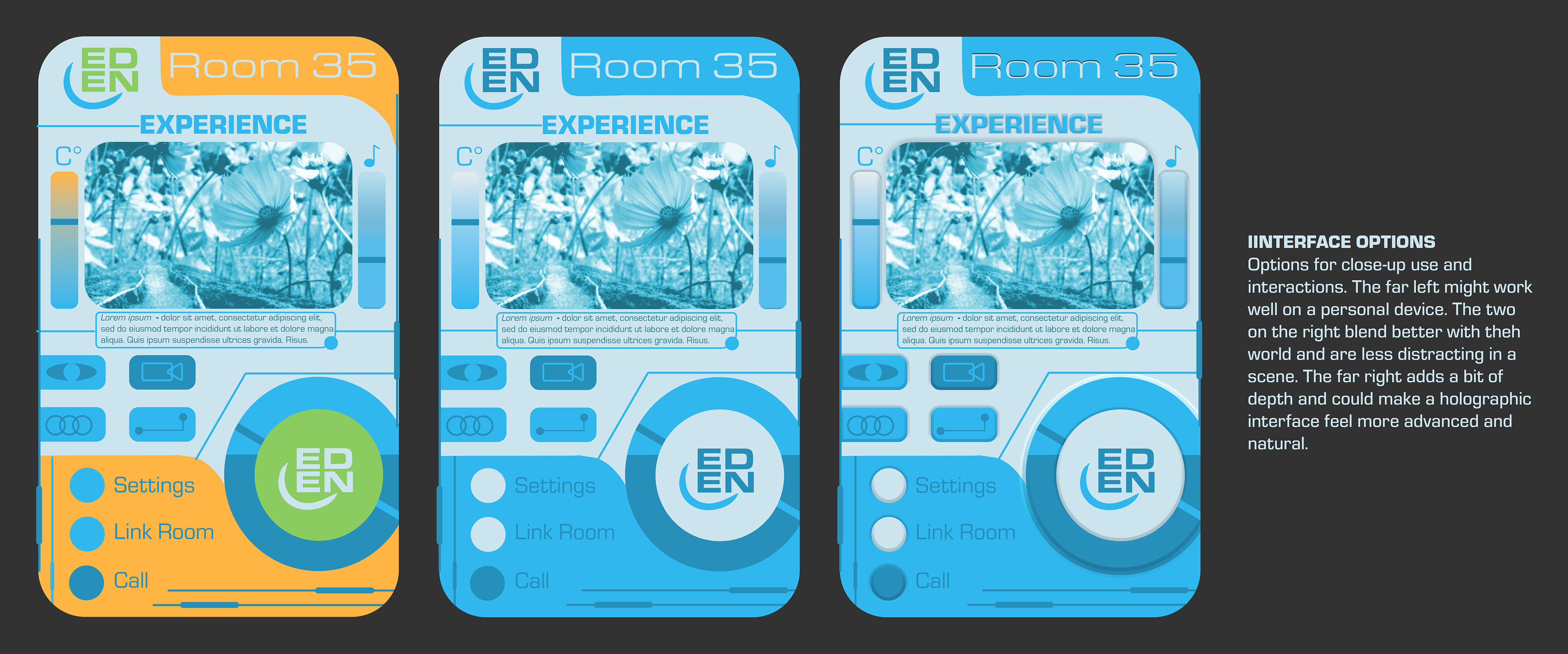
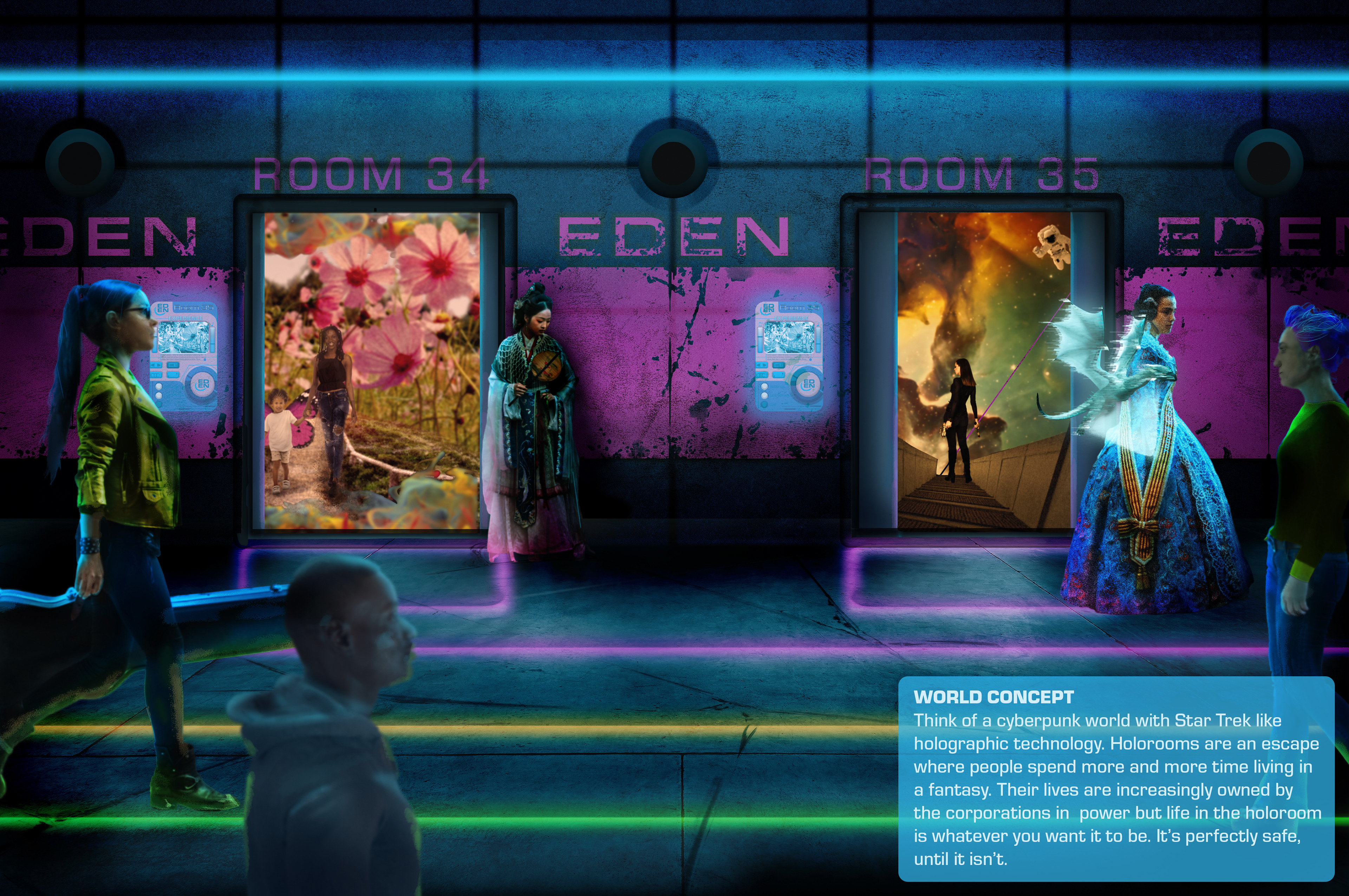
For this project I created a world concept that mixes cyberpunk elements with the idea of holodeck technology as seen in Star Trek. I took inspiration from science fiction design from Star Trek, Cyberpunk 2077, and The Expanse. I also researched current "holographic" technology and existing virtual interfaces. I selected colors, created a mock UI, and a concept image to bring it all together. The entire project was done in Photoshop with the use of stock images and Photoshop tools. No AI was used in this project.
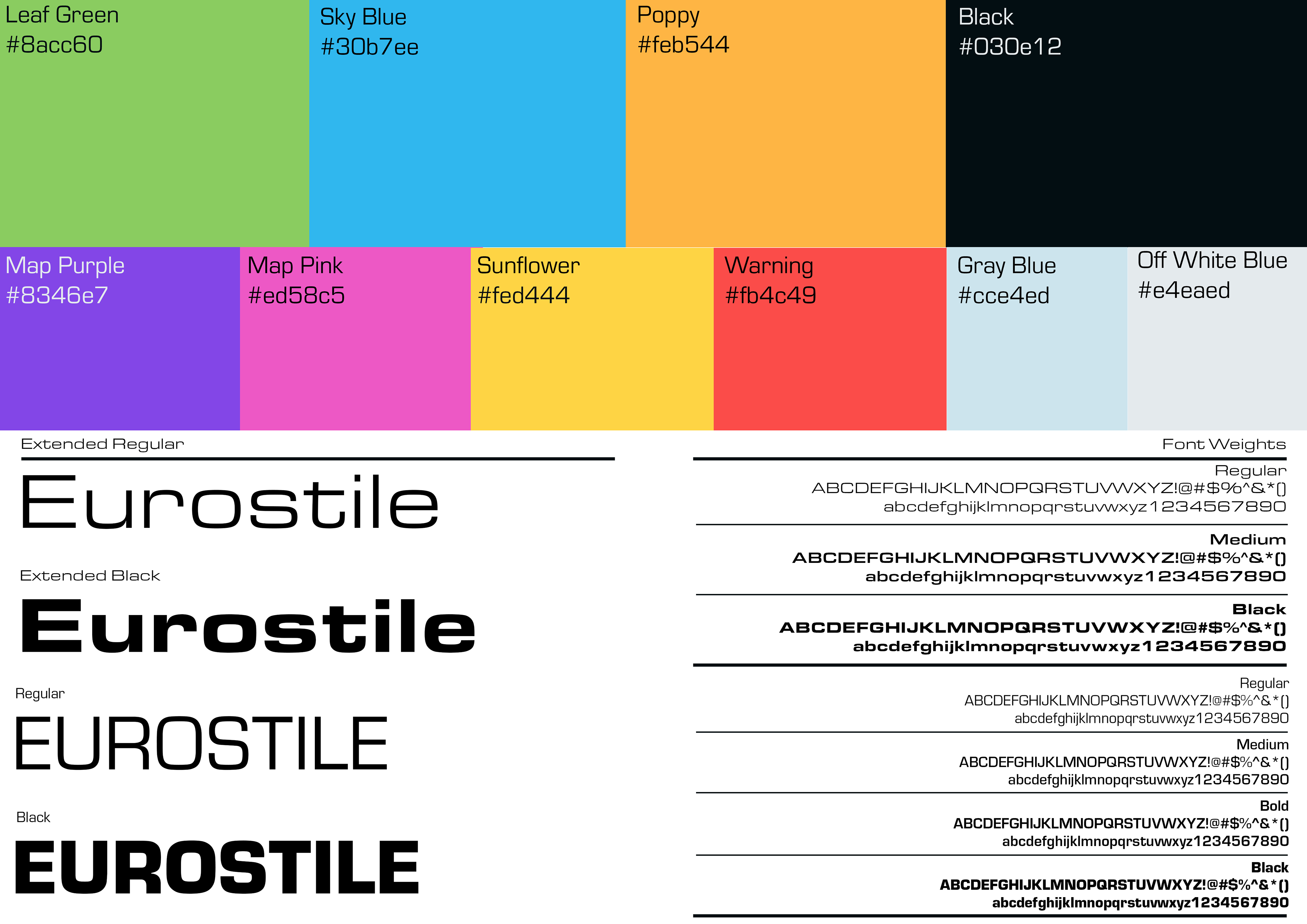
I based my color selection off of what is immediately recognizable to audiences as "high tech sci fi" colors. It turns out that some shade of blue is the most common color in science fiction going back decades. There have obviously been departures from this but in making this choice I decided I wanted my prospective audience to immediately recognize the visual cue and then build from there. I chose the green and golden yellow as additional colors because in this particular dystopian future the corporation that controls the holodecks is still trying to pass itself off as natural and friendly. A welcoming mask hiding a darker reality. Eurostile was chosen as the main font for this same reason along with it's plentiful selection of weights and styles. I felt that overall keeping with a known series of visual cues would allow more room to focus on the many worlds that exist within holographic worlds rather than having the focus on the technology itself.